

Articles
Logo Design Trends in 2021: How Things Have Changed!
From 2020 to 21, we didn't have a predictable year. Scorn it though evolution is indeed amazed the world in 2020 and will continue to do so in 2021. Every change has its pros and cons, however, we have accepted some of them while we are still waiting for others to leave. Let's not remember the negative, right? Similarly, the 2021 logo design trends may bring mixed views and feelings, but they are well worth it.
Minimalism continues
Let's start with a logo design trend that will hopefully never lose its relevance and charm - minimalism. It is undeniable that this trend is not entirely a 2020/21 innovation, however it has survived even the Covid wave and slipped into 2021 with ease. Why? Minimize mistakes with minimalism!
Not only are minimalist logos the preferred choice of any brand looking to showcase professionalism, they are highly responsive and therefore more important than ever due to the frequent changes in technology and the digital world.
The elegance of minimal logo with simple fonts and neat appearance has caught the attention of several companies/brands.
The following are examples of mogul brands that are already taking a minimalist approach and not intending to change their minds in 2021. Can you guess this?
Dipping your logo in ink
In 2021, logo design trends are turning into ink. I'm not saying this literally - did I scare some of the designers here? Oh no, no real pens or nibs are used here, only ink style visuals created on a digital canvas. Nonetheless, these designs can be difficult to develop and use, but they can have a big impact, especially for companies that it is necessary to portray a vintage or artistic look without using typical emblems (sorry, but we have already seen too much).
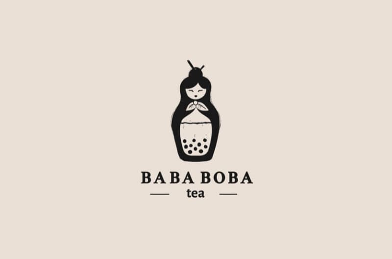
From branded logo designs to dashed lines with some interesting detail, and even images that appear to be drawn ink, there are endless possibilities to make your logo classic with "ink". If you are still not sure how to look like a handwriting style logo, here are some examples to help you visualize:
Stained glass - looking back
Are you ready for a little history lesson along the way? Ironically, even in design, we sometimes need to look back in order to move forward! This time, the logo design was inspired by the stained glass windows used first by the elite Romans in the first century AD, and then medieval churches and mosques.
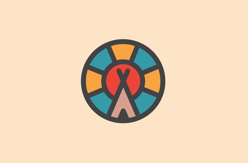
The charisma of a visual image broken down into separate colors, but when viewed from afar, will create one beautiful image, was not an exaggeration. We don't rule out the fact that designers are leaning towards minimalism, but they are trying to bring the old into the new without cluttering it up.
In addition, holiness and peace are two important elements of logo design trends in 2021. No surprises given the continuous chaos the world. That's what these logos are about. So, if you want to add something magical to your logo and give your brand a serene look and depth without falling into complex design elements, here is your answer.
Creative writing
While wordmarks are nothing new, they have been updated in 2021. This year, you can see that the trends in design logos are shifted towards a somewhat rebellious end. Designers and marketers still agree that wordmarks are a minimalist trend that should not go away as they also serve the brands by drawing more attention to the brand itself. But here's a big BUT; it's such a cliché!
It's been repeated so much that it's now like a shortcut to simply skip the entire logo creation process. Maybe, designers have realized this in 2021, and so logo design trends have cleverly tampered with the typical wordmark. The idea is to make one letter recognizable, creative and attention-grabbing!
Symmetrical logos
What is professional logo design without balance, huh? Even if you take an abstract approach, your logo should never look like it was created without margins. Symmetrical logos have a double factor: they are mirror images of each other, if you split them in two. Here are some examples to clear the fog:
These logos take a symmetrical approach and don't we recognize and adore them?
The general consensus that it's "too balanced" or symmetrical in this case is that it's too regular or monotonous. However, symmetrical logos give the impression that the brand is solid and strong in its vision and has a structured identity. However, we need to see if these logo designs in 2021 can continue to stand their ground and withstand creative criticism or not.
Characterizing
Brace yourselves because 2021 is going to be full of logo design trends that might shock you a bit. There are several paths for designers and brands depending on what you want to portray. So, if you are adamant about adding a pinch of humor in your restaurant or a little funk in your juice bar, weird characters are your best bet! Of course, if you are a bank or advisory service, you wouldn't want cartoon characters to be the face of your brand, but for companies that focus on fun and friendly, you can let your imagination run wild this year with logos.
Many of us wanted to take a picture with McDonald's famous Ronald McDonald, a freaky clown that didn't exist, and yet somehow we had an association with him! That's exactly what they're aiming for logos with funny and dainty characters connect with customers. Remember Pringles?
Symbolism meets modernism
Are we time travelling, or what? Design trends in 2021 have obviously favored old art and symbolism. Maybe, designers have a secret desire to go back in time and stay there peacefully (just adding a thought here). It should be noted that the logos themselves are a kind of descendants of symbols that came from ancient times.
Without digression, let me tell you about this new trend. In 2021, design trends have merged with the symbolism of a century ago. According to experts, adding symbolism to your logo can depict hope, a new beginning and the promise of success - there are no superstitions here.
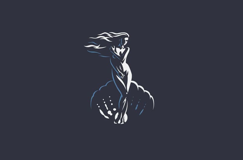
These symbols, such as "eye", "phoenix", "Greek goddess", "yin and yang", along with many others, convey a point of view and are known to possess this or that “power”.
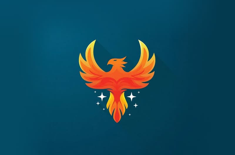
So, for example, there is a brand that wants to convey a message about how they can overcome any challenge and rise to the top. It is known that the phoenix "rises from the ashes" and therefore can effectively convey this message if it is included in the brand logo!
Small perspective
As mentioned earlier, designers in 2021 simply can't let go of the importance of a minimalist logo. However, they want bring back some depth to your design without cluttering the canvas, so logo designs can get some perspective in 2021 (pun intended).
With some simple sketching techniques like linear perspective or foreshortening, logo designers in 2021 set out to add illusions to your design so that your logo doesn't look exactly like a 3D box or ball, but just looks like one!
Nature inspiration
After a very desolate year, nature really started to grow on us. Logo design trends in 2021 can't help but draw inspiration in nature, adding freshness and vitality to the brand's personality. As organic and more nature oriented brands, there is an urgent need to develop more and more interesting logo designs, which demonstrate a sense of "green thinking".
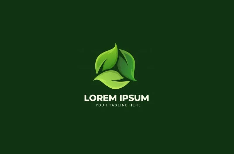
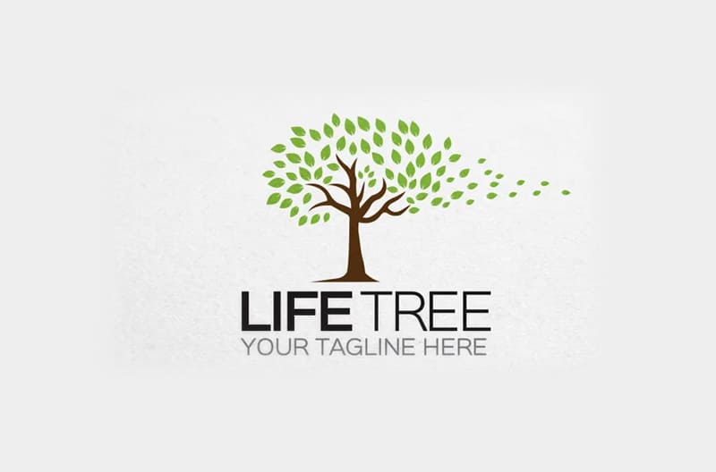
This presents a bit of a challenge due to the many logos being designed for several brands that adhere to environmentally friendly approach, especially in their marketing tactics. Let's see how "naturally" we can get creative!
All in black and white
To stand the test of time is an unprecedented and successful trend in black and white! With the advent of 2021, this logo design trend is simply won't say goodbye, and why should she do that? When you're aiming for a more stylish look, black and white are two contenders that work best together!
From simple fonts on black and white backgrounds to animated logos and 3D designs, black and white continues to dominate trends logo design in 2021 and will continue to be a serious competitor to all other trends. The point is that you rarely wrong! The design trend has gained popularity among jewelry brands, furniture stores and clothing / textile brands, as well as in extravagant restaurants that want to create a noir look.
Trends are made to follow. Yes or no?
As 2021 accelerates, there is a huge controversy in logo design trends. On the one hand, we adhere to minimalism, and on the other hand, we look for inspiration in cartoon characters! Needless to say, the trends are not should define your brand or design. No rule of thumb! The brand defines the logo design, and it's not literal. Your logo design should reflect the personality of the brand, if it doesn't, your creativity or "fashion" design might just become part of your gallery digital art.
Create your own trends and maybe your logo will appear in our next blog